When writing copy for your website or a document, follow these best practices to make your content more accessible, reader friendly and understandable to a larger audience. What’s good for accessibility is also good for readability for everyone!
There are many factors that affect the readability and accessibility of your content. Taking minor steps can have big impact. Your copy will not only be more accessible for those who need it but also more reader friendly for all users.
Reading Level
The reading level is the level of education that the average person needs to have in order to understand your content. It can be assessed by a scoring system such as Flesch-Kincaid, Gunning-Fog or SMOG. These systems may take into account the total number of words, sentences, syllables and complex sentences.
Lower reading levels are understandable by the highest amount of people, while higher reading levels are understandable by fewer people. Lower reading levels also make for faster reading.
What’s important to understand is that most people do not read at the same level at which they are educated. That means that just because someone is educated at a 12th-grade reading level, for example, it doesn’t mean they read at that same level.
Recommendation
Generally speaking, it’s best for your copy to be at a sixth- to eighth-grade reading level. But consider your audience. If they are younger, target a lower reading level. If they have an education level beyond college, you could aim for a higher level.
Assess the reading level with a tool such as:
Copy and paste your text into one, and it will assess the reading level of your copy.
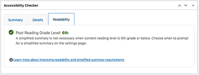
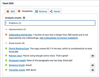
If your website is built on WordPress, you can use a plugin to do this, saving you the time of copying and pasting your copy page by page into a checker. There are free and paid versions of the Accessibility Checker Pro and Yoast SEO plugins. They show the results on each page of your website in the back end.
The main goal of these particular plugins is not to assess the reading level of your website copy. It’s only part of what they offer as part of their services. However, you likely also want to check the accessibility of your website copy or its SEO, so these are helpful to check the reading level along with some other factors.
Acronyms
Acronyms may or may not be well known among your audience, and some may be confused with others.
Recommendation
Spell out acronyms at their first mention and include the acronym in parentheses, so that it is clear what they refer to. You may also wish to spell out the same acronym again, if it is mentioned much later in the content and if it is not commonly known among your audience. This also helps individuals who have memory impairments who would otherwise need to go back and search for the acronym earlier on in the copy.
Referencing Content
When you reference content in your copy, such as a table, figure or sidebar, use absolute instead of relative terms, which may not be understandable by all individuals. If the content is on the web or in an EPUB, the position of elements may change relative to the width of the viewport—desktop versus tablet versus mobile phone and even portrait versus landscape views.
Even if the content is in a document with a fixed layout, where the position doesn’t change, blind individuals who use a screen reader may not understand which element you are referring to. They won’t understand the position of elements in the layout because it relies upon them having to see them.
When you reference content by a title or label (which doesn’t change based on position, for example), then it’s clear to everyone what you are referring to.
When you reference content by color, that content is dependent upon someone being able to see and distinguish that color. Someone with color blindness may not see the color you reference and may face difficulty with those instructions.
Recommendation
Give tables, figures and sidebars titles. For example, instead of “See the table at right,” use “See table 2.”
Use “select” instead of “click” when instructing users, where applicable: “Select the Submit button.”
Also don’t make reference to an element by other visual characteristics such as shape or size, or by sound.
Paragraph Length
The length of paragraphs in your copy can affect the readability.
Longer paragraphs may make the content feel daunting. There is less of a visual break for the eyes. The page, whether web, digital or printed, has less white space.
Readers with or without a disability may be less likely to read your copy as a result.
Shorter paragraphs are more inviting for all readers. They can also make for faster reading.
Recommendation
When writing your copy, break long paragraphs into multiple, smaller ones where it makes sense to do so. A good rule of them is three to five sentences.
Text Alignment
The alignment of text is important, as it affects readability and speed.
Text can be:
- Left aligned/flush left,
- Fully justified,
- Centered,
- Right aligned/flush right.
Flush Left
Text that is left aligned, or flush left, or flush left/rag right means that the text aligns at the left margin and has a “ragged” edge at the right margin.
Justified Text
Text that is justified (aligned at both the lefthand and righthand margins) is much harder to read, especially when there are long blocks of it.
It may look “clean” because the text nicely lines up at each margin, but it can result in variable spacing and large gaps of space between words, which slows down reading.
Sometimes, there ends up being more space between words in justified paragraphs than between the lines of text within a paragraph. This can cause the eye to track to the line of text below it instead of to the next word in the same line.
Centered Text
Centered text is problematic because it makes it harder for the eye to track to the next line. The starting point for each line is in a different position. Long lines of centered text are even harder to read.
Flush Right
Right-aligned text is also hard to read because the eye is used to tracking each line of text from the left. When text is right aligned, the lefthand margin or starting point is different for each line.
Recommendation
It’s best to align body text as flush left, rag right.
If you center or right align text, do so sparingly and for very short text (only a few lines at most).
On the web specifically, avoid justified text even with hyphenation.
Line Length
Line length plays a part in readability.
Longer line lengths make it harder to track to the next line because the beginning of the next line is so far away from the end of the previous line. On the other hand, too short of a line length means your eye has to dart back and forth quickly, which actually slows down reading.
Research shows that anywhere from 45 to 100 characters per line results in faster reading. That’s a general guideline, because text size plays a factor. A line length of 100 characters at 6 points or 8 pixels would not be read as quickly as text at 14 points or 18 pixels at the same line length, for example.
Recommendation
Consider the line length and text size. For documents, consider using columns, especially for documents in a landscape orientation.
Note: To maintain a certain number of characters in lines of text, do not insert forced line breaks like you would with a typewriter. Line length should be controlled with proper layout practices.
Hyphenation
Some individuals with cognitive impairments may find hyphenated words hard to understand.
In documents, it’s customary to hyphenate text, especially with full justification, to prevent large gaps of white space between words. Text without hyphenation is more readable than hyphenated text, except when the text is fully justified.
Recommendation
Avoid hyphenation on the web. For documents, if possible, avoid hyphenation unless fully justifying text.
If you do use hyphenation, consider limiting the number of hyphens that appear at the end of consecutive lines of text within a paragraph.
Headings
Headings are important for copy in a document or a web page. They serve several purposes.
Readable
Headings make the content easier to read. Pages with separate sections of content instead of one chunk of long running text are easier to read. They give sighted user’s eyes a break, and the text is more inviting to read.
Understandable
Headings, when used properly, make the content more understandable by conveying a visual and structural outline for your content.
Sighted users can see the headings and their different levels based on how they are styled. Blind individuals or those with low vision will understand this hierarchy because a screen reader or other assistive technology will convey it to them.
Navigable
Headings make the content easier to navigate. Sighted users can visually scan the headings on a page to find information quickly. Users of assistive technology can use shortcuts to jump to different headings on a page. They can also pull up a list of headings on a page.
Recommendation
Break up your content into logical sections, adding a heading at the start of each new section.
Use heading 1 for top-level headings, heading 2 for the next heading under that and so forth. Use additional headings in the proper sequence in each section as needed.
Hyperlink Text
What you use for hyperlink text can either make things easy or more difficult for users of assistive technology such as a screen reader.
Oftentimes, long URLs are written out and hyperlinked such as: “Download the report at https://gratzergraphics.com/downloads/report.pdf.”
This results in a screen reader voicing the entire URL. The URLs are often long and verbose and not descriptive. So users may not understand where the hyperlink will take them.
It’s also not helpful to add words such as “click here.” Users of assistive technology will know that the text is a hyperlink. That will be announced to them. Also, not everyone click a hyperlink. Some people may tap, some may hit Enter or Return, and others may do something different depending on the assistive technology being used.
Recommendation
Use meaningful and short text for link text. For example, “Download the report.”
Visuals
Supplementing your copy with images can be very helpful for people to understand your content.
Some people are more visuals learners. Others may have a cognitive or learning disability and benefit from having both the text and a visual to understand the content.
But images also help break up the content, which make it much more reader friendly and inviting.
Recommendation
If possible, add photos, bar charts, pie charts, line graphs or infographics to your content, especially if the subject matter is very detailed or technical.
Get Help With Accessibility
If you need help with accessible branding, accessible publication design and layout, remediation or a website accessibility audit, get in touch.


Thank you. This was helpful
This guide has several suggestions for things I was doing based on what felt right to me. I wondered if you had any studies I could point to for more robust evidence that this is what people need. For example, hyphenated words. Thank you.