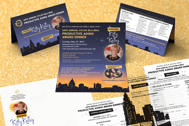
Get Stellar Results for Your Nonprofit Event With a Design That Shines


Images tell a story. Are yours telling the story you want to tell? If you’re like many organizations, you might inadvertently be minimizing the role of images in your messaging. Maybe you: don’t realize their importance, choose images that don’t speak to your audience, don’t know where to find quality images or don’t understand that using bad images is worse than using no images at all.
Continue reading How Bad Images Hurt Your Marketing and FundraisingGuest blog by Kathy Widenhouse
When times are hard, one of the biggest nonprofit fundraising mistakes you can make is to complain. Partners and prospects read negativity, and click “delete” or toss your letter quicker than the latest stock market indicator plunge. And why not? They hear plenty of it already on the news.
Even in down times, you can cultivate your readers and build your audience. One key is to keep the right tone. Make sure you avoid these other nonprofit fundraising mistakes in your development copy that could lead you down the wrong path … and cause you to lose supporters.
Continue reading 5 Deadly Nonprofit Fundraising MistakesYour nonprofit may have put up a website, thinking that new members, donors or clients will just find it. But it doesn’t work that way. You need to put out relevant, engaging content and have your website optimized for search engines, so your organization can climb the ranks of Google. Let’s take a look at how your site’s SEO affects your organization.
Continue reading How Your Site’s SEO Affects Your Organization