Are you alienating your audience? If so, get responsive (design, that is). If a good chunk of your clients, members or customers are using mobile devices to browse your website and read your e-mail promotions and these are not coded as responsive designs, then your audience may not be as responsive (no pun intended) as they could be. Here’s what I mean: how many times have you viewed a website on your mobile phone, only to leave the site abruptly because it was too frustrating pinching and panning in and out to get to a particular menu item or to find what you need?
The percentage of mobile users has only been increasing. Having a responsive website and corresponding e-mail design provides a much more user-friendly experience, whether it’s on a desktop web browser or a mobile device, and it’s all done within a single design, not separate mobile sites. It’s not just about shrinking down the site to fit the size of the device; it’s about making the text legible and links easy to click on when the site appears smaller so the user does not have to pan in to read it or swipe to see all of the content. It’s a great way to cater to users of computers or mobile devices while not having to create and maintain separate sites. It’s also a way to increase your search engine optimization (SEO), as Google frowns upon separate mobile-only sites.
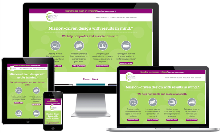
Our website is an example of responsive design. In a computer web browser, view how it works by making the browser window narrower and wider; also view it on a mobile device to see how it works there. You can do the same with our enewsletter.
See more stats about responsive website design
Check out our responsive website designs