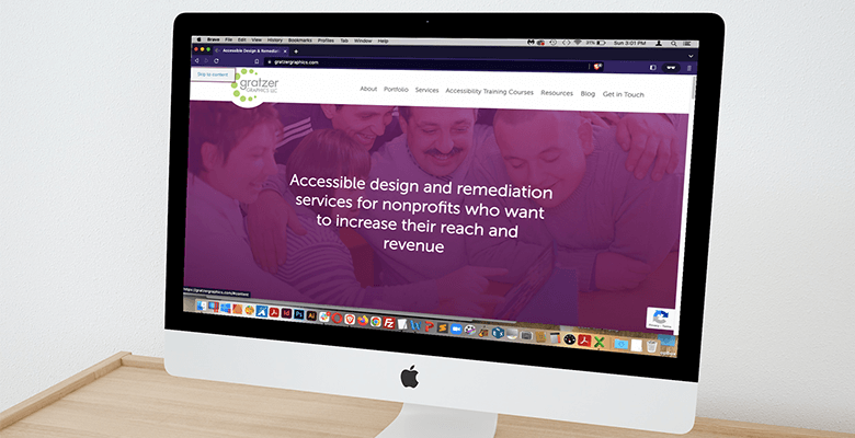
There are many ways to check the accessibility of your website. There is also one very easy thing you can do to make your website more navigable and accessible for sighted users and screen reader users. That is to add a skip link.
What Is a Skip Link?
A skip link, which may also be called a “skip navigation,” “skip to content,” “skip to main content” or even “bypass link,” is a link on a web page that allows keyboard and screen reader users to skip repeated areas on a website.
The most common type of skip link, which most people refer to, is a “skip navigation” link. This is a link that allows different types of keyboard users to bypass repeated links in the header, such as the navigation menu.
A website may also include a skip link to quickly navigate to another section of a website, such as a “skip to footer” link.
Purpose of a Skip Link
The Web Content Accessibility Guidelines (WCAG) accessibility guidelines—specifically WCAG 2.4.1, Bypass Blocks—states:
A mechanism is available to bypass blocks of content that are repeated on multiple Web pages.
WCAG does not require a skip link, but that is the best way to achieve this.
Without a skip link, most keyboard users have to start navigating a web page from the top of every page and go through all of the links in the header. This can be time consuming, especially if the header has a lot of menu items and if they visit multiple pages on your website.
Sighted keyboard users are forced to tab on the keyboard to the header, to the navigation and then to every single menu item until they get to the main content of the page.
Sighted keyboard users could be individuals with fine-motor issues who cannot use a mouse, such as people with multiple sclerosis or a broken arm or wrist. They could also be individuals with limited hand or arm mobility, such as from carpel tunnel.
Some of these individuals may use an assistive device that interacts with the keyboard, such as a sip-and-puff device, which allows someone to use part of the mouth, cheek, chin or tongue to use the computer; a mouth stick; or head wand.
Without a skip link, they have to move their mouth, cheek, chin or tongue, or tap their head just to get to the start of the page content. Then they go to another page on the website and have to do it all over again.
Imagine if there are 20 items in the navigation to get through!
For those who would have to repeatedly tab on the keyboard, this could make a repetitive stress injury such as carpel tunnel worse. For those who have to tap their heads or puff through their mouth many times simply to get to the page content, that could be uncomfortable or exhausting.
In any case, that makes for an unhealthy workout! If users have to do that much work on your website, they likely won’t stay.
Screen reader users, who also use the keyboard, at least also have the ability to pull up a list of headings on the page so that they can quickly navigate to the page content. However, that depends on whether or not headings on the page have been added in the first place and then formatted properly.
Testing a Skip Link
It’s easy to test a skip link after you add one or to see if your site has one already.
Simply put your cursor in or tab to the URL area of the browser.
Tab through any browser elements until you get to the web page itself.
The skip link should appear once you tab to it, then hide once you tab to the next hyperlink in the header.

