 Understanding color accessibility is important to ensure that individuals with certain visual disabilities can read and understand your content.
A lot of clients ask us about contrast and color accessibility. Some find the contrast guidelines confusing, and others have told us they thought they could not use certain colors when it comes to accessibility, so we want to dispel some misconceptions and help you better understand color and accessibility.
What Color Contrast Means
First, let’s clarify what “contrast” means. When it comes to accessibility and talking about contrast, we refer to a contrast ratio, which is the difference in perceived luminance (brightness) between a foreground and background color. For example, stark black text on a white background has the highest possible contrast ratio of 21 to 1.
Misconceptions About Color Accessibility
There are several misconceptions when it comes to color and accessibility.
“Accessibility means designing with only dark colors.”
A lot of clients think that accessibility means designing with only dark colors.
In fact, once, we were designing an email that needed to have an accessible color scheme. The client initially sent us the color codes for only their darker brand colors, because they thought we wouldn’t be able to use any of their lighter colors.
But you must know:
There is no such thing as an inaccessible color! It always depends on how the colors are used together.
If you use only dark colors, you limit your options from a design and accessibility perspective.
“Accessibility is ugly.”
A lot of clients think that accessibility means the design will be ugly.
A lot of designs are unattractive, but they’re not ugly because they’re accessible. They were just poorly designed. Accessibility has absolutely nothing to do with how visually attractive a website, a document, a design or a graphic is.
The majority of documents and websites aren’t even accessible to begin with, so the likelihood that you’ve come across them isn’t that high, unfortunately.
Why Color and Contrast Are Important
Color and contrast are important to consider for many different groups of people to be able to read and understand your content.
Low Vision
The first group is people with low vision, which may be caused by macular degeneration, cataract, diabetic retinopathy or glaucoma, for example. These individuals may not be able to see things in the center of their vision or on the sides. They may not be able to see in low light, or they may have blurry or hazy vision.

Color Blindness
Another group is people with color blindness, which affects one in 12 males and one in 200 females. Someone may have been born with color blindness or it could have occurred from a head injury.
There are several types of color blindness.
Red-green Color Blindness
One type of color blindness is red-green, which is also the most common form. Green looks more red or red looks more green and less bright. Two other forms of red-green color blindness mean that someone cannot tell the difference between red and green.
Here are examples of how individuals with red-green color blindness would see this image. The original photo is first, and the other ones show how someone with red-green color blindness would see that same image.


Blue-yellow Color Blindness
Blue-yellow is another but less common form of color blindness. The two types of it make it hard or impossible to tell the difference between blue and green, yellow and red, or yellow and pink.
Here are examples of how individuals with blue-yellow color blindness would see this image. The original photo is first, and the one after it shows how someone with blue-yellow color blindness would see it.


Note how the blue building looks more green, the green building looks more gray and the yellow building looks pink. Imagine how referencing something by color alone would be troublesome for many individuals to understand.
Complete Color Blindness
Complete color blindness is another form, although rare.
Perceptual Processing Disorder
Individuals with a perceptual processing disorder—also called Irlen syndrome, scotopic sensitivity syndrome or visual stress—are also affected by contrast. Interestingly, a perceptual processing disorder is not actually an issue that originates with the eye. It actually involves the brain’s ability to process visual information.
According to the Irlen Syndrome Foundation, the disorder affects 14% of the U.S. population—including some people with learning difficulties, autism, attention and concentration issues and others. Individuals with Irlen syndrome may see stark black text on a white background as blurry, moving, wavy or even disappearing.

Cognitive Disabilities

Individuals with a cognitive, learning or neurological disability can also be affected by color and contrast. Some of these types of disabilities include:
- Autism,
- Down syndrome,
- Multiple sclerosis,
- Attention deficit disorder (ADD),
- Dyslexia,
- Seizure disorder (epilepsy) and
- Traumatic brain injury.
Use of certain colors may even trigger seizures. Specific colors can actually aid or hinder comprehension in some of these individuals as well.
All Sighted Users
You might be surprised to discover that all sighted users—with or without a disability—are affected by contrast.
Low-contrast color combinations such as white on yellow or white on turquoise (or vice versa) are popular color choices by designers, but they make it hard or impossible for individuals even without any form of visual disability to read the content.

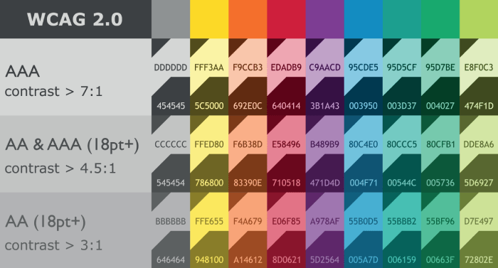
Color and Contrast Guidelines
In order to tell if colors are accessible or compliant, we refer to the Web Content Accessibility Guidelines (WCAG, pronounced “wih-cag” for short). They provide 3 levels of conformance—A, AA and AAA—ranging from minimum to stricter.
The typical level of conformance to meet is AA. Most accessibility laws, such as Section 508, reference level AA for conformance.
The purpose of these guidelines is to help all readers or web users be able to read and understand content.
Color Guidelines
WCAG 1.4.1 Use of Color
One of the WCAG guidelines that deals with color is 1.4.1 Use of Color, which means you can’t use color alone to convey information.
An example of this would be a table that uses color alone to convey data, such as red means this, green means this.
It could also apply to pie charts and line graphs that have legends, where color is being used to associate data.
It also means that hyperlinks can’t just use color alone to distinguish them from other text. There needs to be another method to tell someone that this is a hyperlink.
Contrast Guidelines
We can’t use color alone to convey meaning, but we can use contrast. This will also ensure readability for most individuals.
WCAG 1.4.3 Contrast Minimum (Level AA)
WCAG 1.4.3 Contrast Minimum says that text and images of text that are “normal” size must have a minimum contrast ratio of 4.5 to 1 against their backgrounds. But large text only needs a minimum of 3 to 1 contrast against its background.
To qualify as large, text must be at least 14 pt (18.66 px) and bold or at least 18 pt (24 px) any weight.
WCAG 1.4.6 Contrast (Enhanced) (Level AAA)
The level AAA requirement for contrast is very rare. It states that normal text needs to meet at least a 7 to 1 ratio, and large text needs to be 4.5 to 1 or greater. It is the same as 1.4.3 but with higher minimums.
No Contrast Requirement
Some elements for which there is no contrast requirement are:
- logos;
- decorative elements that don’t convey meaning such as borders or decorative elements;
- heat maps, which have to use low-contrast colors, so that you can see the page content beneath the colors; and
- screenshots.
WCAG 1.4.11 Non-text Contrast (Level AA)
WCAG 1.4.11 Non-text Contrast calls for at least 3 to 1 ratio of contrast against adjacent colors for:
- user interface components and their various states, such as hover and focus; and
- graphical objects that convey meaning.
Note this is “non-text” contrast. Text is addressed in WCAG 1.4.3 and 1.4.6. The 1.4.11 guideline applies specifically to other—non-text—elements that convey meaning.
Examples of user interface components are hyperlinks and borders on form fields. Graphical objects might be pieces of a pie chart with a legend or lines in a line graph.
How to Check Contrast
To ensure your colors meet contrast requirements, you must actually check the contrast of the foreground and background colors, understanding how they’re used—normal text, large text, or as user interface or graphic components.
The simplest way to do this is to use the TPGi Colour Contrast Analyser app, which is free to download. It samples color from any program, from anywhere on your screen.
Unlike many accessibility guidelines, which are subjective, contrast is pretty cut and dry.
Conclusion
Checking and ensuring sufficient contrast means that individuals with a visual disability—whether it’s low vision or color blindness— and those without a visual disability can read and understand your content.
If you need help understanding how your existing color palette can be made to work accessibly, contact us to discuss.
We offer assessments of brand color palettes; create accessible brand style guides, so you know which color combinations you can use where; and provide training in color and accessibility.